
Turnitin Clarity
OVERVIEW
Turnitin is an education technology company that provides a suite of solutions for academic institutions.
Clarity from Turnitin is designed to bring transparency to the student writing process by providing visibility to educators into their writing journey, including their use of AI tools along the way. This helps the educators to assess the student work for academic integrity and originality.
ROLE AND DURATION
Product Designer (co-lead) the Instructor Report Design
IA, Interaction Design, Usability testing prototypes, High-Fidelity UI, Responsive designs, Accessibility Annotations, Engineering hand off
November 2024 - August 2025
Supporting Academic Integrity in an Evolving Writing Landscape
For many educators, Turnitin has long been part of the everyday practice of teaching and assessment. Its tools have helped instructors think about academic integrity and originality while navigating the practical realities of grading, feedback, and evaluation. By offering signals that support authenticity checks alongside ways to review and respond to student writing, Turnitin has played a steady role in how educators interpret and engage with student submissions.
When Generative AI Changed How Writing Happens
Generative AI has fundamentally changed how students write. What was once a solitary process of drafting, revising, and struggling through ideas now often happens alongside powerful tools that can assist, accelerate, or even replace parts of that work. For educators, this shift introduces a new challenge: how to support responsible use of AI while still fostering critical thinking, resilience, and authentic learning. As traditional signals and final submissions become harder to interpret, educators are left asking a deeper question, not just what students submit, but how that writing comes to be.
To understand and empathize with this challenge, let’s step into Professor Richards’ classroom and follow her students’ writing journeys.


What instructors needed was not another score, but visibility into drafts, revisions, pacing, and patterns over time. Understanding the writing journey became essential to interpreting student work fairly and thoughtfully.
Introducing Turnitin Clarity
Turnitin Clarity was designed in response to this need. Rather than focusing solely on the final submission, Clarity provides instructors with insight into the full writing process, helping them see how a piece of writing evolved over time and how AI-assisted activity fits within that journey. The goal was not to replace educator judgment, but to support it, by pairing transparency with context in moments where interpretation matters most.
The Clarity ecosystem consists of a student writing environment called the Composition Workspace and a report detailing the writing process for the educators called the Writing Report.
Composition workspace
Composition workspace allows the student to begin, pause, resume and refine their work, all while enabling educators to gain insights into the students’ writing process. It also offers responsible and ethical use of AI based on permissions set for AI usage at the assignment level by the instructors.
Writing Report
Each submission generates a report for the instructors to view and interact with - The Writing Report. This report equips the instructors with the insights and supporting data into how students constructed their writing, from creation to submission, which aids in teaching students to write with integrity and foster more meaningful engagement between educators and students.
Shaping Instructor's Writing Report: My Role in the Design Journey
My Role
Product Designer (co-lead) the instructor report redesign
Timeline
November 2024 - August 2025
Team
UX (Design + Research + Content) | Product | Engineering
Deliverables
IA, Interaction Design, Usability testing prototypes, High-Fidelity UI, Responsive designs, Accessibility Annotations, Engineering hand off
Rethinking the Writing Report
By the time I joined the project, the first version of the Writing Report was developed and tested. During testing we found that for many instructors it wasn’t telling a clear story. Numbers, lists, and dense panels left educators unsure where to look or what conclusions they could fairly draw. The core tension boiled down to this: we had deep data, but not a digestible way to communicate meaning. My task was to rethink how the report could guide instructors from confusion to comprehension without losing richness.
I co-led a full redesign to create a clearer, more intuitive reporting experience.
Where the Writing Report Fell Short
Initial feedback on the Instructor Report indicated that instructors struggled to interpret it, navigate through it and comprehend the overall message that we were trying to convey about a students’ proof of process.


Across the report experience, instructors encountered rich data without guidance on how to interpret it. It lacked the structure and the hierarchy they needed to quickly understand what mattered and why. Rather than supporting understanding, the report asked instructors to do heavy cognitive work at every step. My design goal was to shift the experience from exposing information to guiding interpretation.
Designing for Clarity: Turning Data into a Writing Story
Working within a three-week sprint framework, I focused on design decisions that directly addressed the core challenges instructors faced in interpreting writing process data. Each sprint helped refine how the experience could better support understanding, investigation, and narrative coherence.
Establishing a Clear and Confident Entry Point
One of the earliest challenges instructors faced was not knowing where to begin. It was difficult for them to tell which submission required closer attention. Instructors were also unclear about what the Writing Report would reveal, making the decision to open a report feel uncertain rather than intentional.
To address this, I focused on providing a clear and confident starting point. Instead of asking instructors to interpret multiple signals on their own, the inbox now surfaces a snapshot of potential writing-process issues along with a preview of what those issues are. This approach helps instructors quickly understand why a submission is flagged and what they can expect to learn by opening the report.
Importantly, this design does not attempt to collapse similarity, AI, and writing-process signals into a single verdict. Each signal remains distinct, respecting the complexity of academic writing and instructor judgment. What changed was clarity: instructors can now prioritize submissions with confidence, knowing both which ones warrant attention and what kind of review lies ahead.

Reducing Cognitive Load Through Structure and Progressive Disclosure
Once inside the Writing Report, instructors were presented with critical data about the writing process. However, due to the lack of structure and hierarchy, it was difficult to understand what that data was actually conveying about the student’s writing journey. Was there a concern? If so, what was it, and how severe was it? It was also unclear where instructors should go next from this page. As a result, instructors were left to mentally piece together the story themselves, a time-consuming and cognitively demanding task.
To address this, I focused on organizing writing-process data into clear categories and creating structured paths that instructors could move through intentionally across the report. Creating categories was much like sorting loose papers into meaningful piles - it helps people decide what to look at first. Within each category, hierarchy allowed broader signals and insights to surface before detailed evidence. With progressive disclosure, instructors could move from overview to detail without losing context, choosing when to dig deeper instead of being confronted with all data at once.
This approach required trading off more ambitious organizational models in favor of designs that could be implemented within tighter engineering timelines. Even so, the experience shifted meaningfully: instead of confronting a dense wall of metrics, instructors now see clear entry points and can navigate the report systematically, moving between insights and supporting evidence based on what they discover.


Creating a Coherent Story of the Writing Process
Once inside the report, another significant challenge for instructors was understanding how key events in the writing process related to time. Although timestamps were available, they were presented as isolated numbers, leaving instructors to mentally calculate when something happened by comparing total writing time, event timing, and the version in which it occurred. This added unnecessary cognitive effort, forcing instructors to reconstruct the writing story instead of being able to see it unfold.
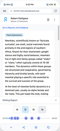
To address this, I introduced a timeline that visually represents the progression of writing over time. Key events are placed along the timeline based on when they occurred, creating an immediate visual connection between actions and their timing. Instructors can play and replay the timeline to observe how the paper evolved, allowing them to understand the writing process as a continuous story rather than a set of disconnected data points.
Together, these design decisions reshaped how instructors move through the report , from first impression to deep investigation.
The Redesigned Instructor Writing Report
In the redesigned report, the experience shifts from overwhelming data to meaningful insight. Instructors begin with context that clearly indicates why a submission is flagged and what they should expect, reducing uncertainty and providing a confident start. Once inside, structured categories and hierarchy help educators navigate findings with confidence. Broad signals and insights appear first, with supporting evidence available on demand, enabling instructors to investigate systematically rather than piecing together fragmented information.
Entering the Report with Context and Confidence
Instructors can now clearly understand which submissions should be looked at first based on what submissions have been flagged and why. A preview of flagged writing-process events gives instructors a clear idea of what to expect as they open the detailed report, reducing uncertainty and helping them begin with confidence. This reduces their anxiety from where to begin and gives them a clear and a confident start.


Navigating Insight, Evidence and Details
Instead of deciphering dense numbers, instructors can flow from big-picture insights to specific evidence with context and cohesiveness intact, reducing cognitive load and decision friction. This structured flow is supported by components like Flags and Observations, which surface key integrity signals and writing events within a consistent investigative path.With insights and evidence connected, instructors no longer jump between disconnected panels. Instead, they follow a guided path from high-level understanding to necessary detail.

Flags
Flags help instructors quickly understand where closer review may be needed and why. Instead of scanning dense metrics, instructors are presented with concise indicators that point to specific moments in the writing process that warrant attention. This allows them to prioritize investigation based on meaningful signals rather than raw numbers.
By default, Flags remain collapsed to avoid overwhelming the instructor, while still communicating the nature of the concern. When expanded, they reveal supporting details that help instructors interpret what happened and decide whether further exploration is necessary. This balance supports quick scanning when time is limited, while still enabling deeper investigation when needed.

Observations
Observations help instructors see how a student’s writing developed over time by presenting key writing events in sequence. Instructors can understand patterns of behavior, such as when large portions of text were introduced, and how those moments fit into the overall writing journey.
This sequential view supports interpretation rather than judgment in isolation. By seeing when and how content was added, instructors gain context that helps distinguish between natural drafting, revision, and potential integrity concerns. As additional event types such as generative-AI use and transcription are incorporated, Observations will continue to provide a more complete picture of how students compose their work.

Understanding process through timeline
The timeline makes the writing journey intelligible at a glance, instead of requiring manual reconstruction. Instructors can easily map the sequence of events on it and can choose to deep dive into a particular event as needed. They can begin interacting with the report either through timeline, or from the Flags / Observations in the side panel and they will always have a cohesive experience.


With the redesigned Writing Report, instructors can now move from uncertainty to understanding with far less cognitive effort. Instead of interpreting disconnected signals, they are guided through clear insights, contextual evidence, and a visual narrative of the writing process. This enables instructors to identify meaningful concerns more quickly, understand how a submission evolved, and focus their time on pedagogical decisions rather than interface interpretation. In high-stakes situations involving academic integrity, this clarity supports fairer, more confident conversations with students.
Early instructor feedback reinforced the value of this approach:
"This was really informative. I haven't seen anything like this report before where it can give you a lot of useful information. I thought it was quite fantastic. This would make the academic integrity hearings go a lot quicker if you can present this kind of irrefutable evidence."
Interactive Prototype
For those who want to explore the flow in more detail, the interactive prototype below demonstrates how the redesigned report behaves in practice.
Responsive Design: Preserving Clarity Across Screen Sizes
Our research revealed that instructors work across multiple devices, ranging from extra large desktops at the university / school, their personal desktops and laptops, tablets and sometimes on their mobile phones. It became important to create responsive designs for different class sizes.
Class size - Extra Large - 1600+dp
Desktop, Ultra-wide monitors
The design (layout and navigation) and experience for the class sizes of Extra large, Large and Expanded remained the same.

Class size - Expanded - 840 dp -1199 dp
Desktop, Tablet in landscape


Class size - Medium - 768 dp -1024 dp
Tablet in portrait, Phone in landscape
For the medium class size, I decided to have the default view with the side panel in the collapsed state and the student paper being fully visible. The side panel when expanded will slide over the paper hiding the a portion of the contents.
The instructors preferred this approach as it gave a clean start to the experience and along with taking their time to decide where to begin their experience - either by clicking on the timeline or by expanding the side panel. It also significantly reduced the cognitive overload of seeing a lot of data with some of it being hidden at the very beginning of the experience.


I redesigned the navigation, such that when a significant event is encountered on the timeline, the corresponding finding will slide from side instead of the entire side panel sliding. This design retains the connection between the event on the timeline with its details on the side panel without creating a competition for space. The instructor can choose to pause and see further details on the side panel by clicking on the finding card.


Class size - Small / Compact <600 dp
For the compact class size, I converted the side panel into a bottom drawer. By default it is in the collapsed state similar to the side panel in class size medium making the experience on smaller devices consistent with each other. The interaction pattern for small class size is similar to medium. During the playback or when the user clicks on the finding on the timeline, a corresponding card appears instead of opening the bottom drawer.


Solving for large number of findings on the timeline
A students' writing journey, in reality, could be several hours, weeks or months long based on what type of writing the student is doing. For example, a final thesis paper writing could evolve over a period of one semester. This would be translated into number of hours on the playback timeline. And, there could be several events of significance that need to be shown on the horizontal timeline. This led me to frame an interesting design challenge:
Design Problem
How might we accommodate large numbers of events on a timeline such that the instructor can easily get an overview of the entire process and can easily and efficiently interact with each event?
The example illustrates a timeline with more than 20 events on the timeline for 25 minutes of writing time. This is the WIP implementation version on a wide desktop.

This problem becomes a lot more evident and challenging when the instructor is working on smaller touch screen devices like tablets and phones.

Solution Approach
I began by exploring the horizontal scrolling design pattern for both types of devices, touchscreen like in mobile, tablets and not touchscreen like desktops. I found that even though horizontal scrolling is widely adopted in touch screen devices, it is considered unwieldy for desktop applications and has not been embraced by desktop users.
Based on the user research, it was found that the instructors used desktops / laptops much more frequently in order to assess student submissions in comparison to touch screen devices. That is why, I first explored design approaches that will not require horizontal scrolling across devices. I wanted to see if that approach could work across all the device types as it will be cheaper to develop that and supposedly will offer a consistent experience.
Without Horizontal Scrolling
Exploration 1 - Portions of timeline expand and shrink
Group events that are closer in time. Ungrouping expands them in place scaling to represent correct time, shrinking the other portion of the timeline.


Pros
-
No horizontal scrolling
-
Any number of findings can be accommodated in a fixed horizontal axis
-
Instructor gets to see a complete picture at a glance with total number of findings and can decide what areas to explore further
Cons
-
The concept of pace does not remain consistent throughout the length of the timeline. The area that is shrunk does not physically represent the correct units of time. This issue will exist for larger, non touch screen devices like desktops as well.
Exploration 2 - In place expansion of the events
Group events that are closer in time. Ungrouping causes them to be displayed linearly above the timeline.


Pros
-
Same as exploration 1
Cons
-
The left-right timeline metaphor gets muddied in this view
-
If there are large number of findings, e.g. 12 grouped together, expansion may need more than one step
-
Tooltip cannot be displayed easily given that vertical space is occupied with two rows of findings
-
The concept of pace still does not remain consistent as the timing between the expanded events is not represented on the timeline.
-
These issue will exist for larger, non touch screen devices like desktops as well.
Exploration 3 - Vertical timeline
Switching the orientation of the timeline from horizontal to vertical


Pros
-
Users are used to scrolling vertically on touch devices like tablets and phones
Cons
-
Not conveying a connection between the playback, the submission and the events. The three pieces were not sitting well together.
-
Non touch screen devices with larger view ports will still need to retain the horizontal orientation along with scrolling.
Conclusion
All the three explorations were tested with the users and discussed with the engineers. The concept of expanding and shrinking the timeline in place which does not maintain the concept of consistent time throughout the timeline was flagged as difficult to implement. There was no clear winner based on the user feedback as well.
Due to this, I explored the other direction of including horizontal scrolling. It is already widely adopted by the touch screen users. For the desktop users, that will not be the only and primary method for navigation because we do have the side panel that lists all the events chronologically.
The above explorations gave me the certainty that I was not breaking convention of including horizontal scrolling on desktops just to stand out. And, it was not possible to solve a multi platform development challenge by having customized solutions for each type i.e. not having horizontal scrolling for desktops and including it for touch screen devices.
Chosen Solution - Horizontal scrolling of the Timeline
Discussions with the engineers revealed that it was possible to show two states of the timeline - a fully zoomed out (compressed) state which fits the timeline as per the screen size and and an expanded state where the length of timeline will represent the actual time.
Initial state
As soon as the instructor open's up the Writing Report, they see the timeline such that its length fits the screen. They see all the events that have occurred while writing the paper. Events that are closer in time are shown as group badges.


Switching timeline view
There are two views available for the instructors. 'Fit to screen' and 'Scale to Actual Size'. Instructors can change this to see the actual scale of the timeline by choosing the 'Scale to Actual Size' option.


Timeline playback and interaction
As the instructors playback the writing timeline, click on a group of findings the timeline scales to represent the actual length with the events placed at their exact timestamps.

Annotate for Accessibility
In process of putting this content in this case study..
Designing Instructor Onboarding
In process of putting this content in this case study..
Fast follow - AI detection for pasted text
In process of putting this content in this case study..